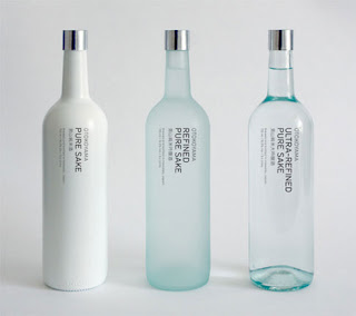
I stumbled across this package a while ago. At first glance, it was quite easy to distinguish what each of them were due to their shape, and the simple labels. The use of different finishes on the bottles makes all the difference. The labels reinforce the purpose of the different finishes, the opaque bottle being pure sake, the matte finished bottle is the refined sake, and the clear bottle is the ultra-refined sake. This is similar to when vodka brands put a little note on the labels that they are "triple distilled". Though this gets the point across, something minimalistic is sometimes a better approach to communication as a design.
Though both types of branding are effective in their own right, among a sea of brightly coloured bottles and cans, this collection of bottles would stand out from the rest because of the lack of all of those things. This makes the minimalistic approach much more effective at times.

No comments:
Post a Comment